
Brand Identity Upliftment
- Oct 5, 2017
- 5 min read
My goal for this project was to locate a brand that I found had the potential to be better. After locating the brand the aim would then be to improve on their current persona, aesthetic appeal and anything else necessary to help the brand perform better.
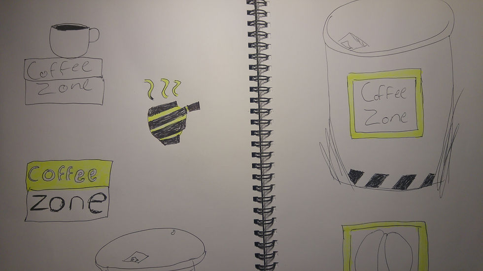
I found a brand by the name of Coffee Zone which is situated in Cape Town city on 1 Cnr Mostert & Plein Street, 800, Western Cape, South Africa. It is a small café / restaurant which serves mostly coffee and sometimes sandwiches and other small foods. The first thing I noticed about Coffee Zone was their logo which was in large above the entrance door. The logo consisted of the words “Coffee Zone”, Coffee in the colour green and Zone in red, along with a thin line that makes a square confining and at the same time over lapping the words. This was their largest form of contact with their target audience so it should perfectly represent them to clients and differentiate them from competitors.
I felt that the conceptual link between their logo and brand name was very week and did not do a good enough job of creating unique identity and differentiation from the hundreds of other coffee shops around Cape Town. It was also very basic and lacking curation and design detail. Upon looking at their menus I found that the same could be said, there is no clear conceptual or aesthetic link between the menu and the logo. The menus were not at all similar to the logo or the rest of the environment. Their colour was different to the logo and the logo itself was not even on the menu, and the layout and structure was not at all similarly curated. The final issue I found was that the store itself lacked aesthetic appeal and coincidence with their brands colours and identity.
Now that I had established the core issues with the brand I then conducted research on competitors surrounding the brand and in Cape Town. Something that I found very common was the artesian, hipster look and feel embedded into most coffee shops today. I released that heading in that direction would leave Coffee Zone in a huge pool of similarly looking floatiest. Ultimately the brand would just get lost in amongst the masses of coffee shops trying to mimic the same look and feel. On top of that just up the road from Coffee Zone is Truth Coffee. Out of all the hipster type coffee shops they go the hardest, and pull it off the best. It became clear to me that a lot of these coffee shops are putting on a show and trying to portray some sort of gimmick in order to attract customers and differentiate themselves. The people who end up going to those café’s generally fit the gimmick and feel accepted for being there. Then there are a majority who don’t fit the gimmick but go because they assume from the gimmick being portrayed that that is where they will get the best coffee.
The key insight I deduce was that a lot of people who go to these hipster coffee shops are not hipster at all and have completely different interests, they go because they assume from the gimmick and what they see that that will be the best possible option for them. A lot of people simply just want good coffee, they don’t necessarily want the flashy show along with it. With this in mind my plan moving forward was to rebrand Coffee Zone’s corporate image in a way that cuts through the all the gimmicks and confusing content. Providing people with coffee in an easy, enjoyable way which at the same time build consumer relationship.
My target market became coffee drinkers who are generally working people. They rely on coffee during the day to accomplish tasks and boost their moral. The second coffee drinker in my target market are people who drink coffee for the pure pleasure and the purpose of drinking coffee. These people are generally upfront, simplistic and pragmatic people. With this in mind I came up with the slogan “Just Plain Coffee” to possibly represent the personality of Coffee Zone. I felt that this resonated with the new core identity I was shaping for the brand.
My next step was to take the information I had gathered and try to instil it into the redesigning of the store Logo, menu and interior design. I began with redesigning the logo. I thought the name was conceptually strong enough to derive imagery and inspiration from. Taking the idea of ‘zone’ from Coffee Zone. I began playing with imagery relating to zones such as, parking lots, signs and streets. I first designed a sign like logo with a coffee cup in the centre and the words Coffee Zone. I felt this was to direct and not visually pleasing enough. I continued playing with this idea through the iteration of scamps. Finally I arrived at an execution which I felt was fitting because it was straight forward and simple but at the same time conceptually portrayed the essence of coffee zone. The new logo I designed consisted of a black coffee cup with white on the inside of the mug. The coffee cup is resting in the centre of a yellow diagonal square. The coffee cup obviously representing coffee and the yellow square representing zoning lies and colour. Seeing the logo is pretty self-explanatory even with ought the words Coffee Zone. It is also unique and differentiates itself from all the other competitors in Cape Town.
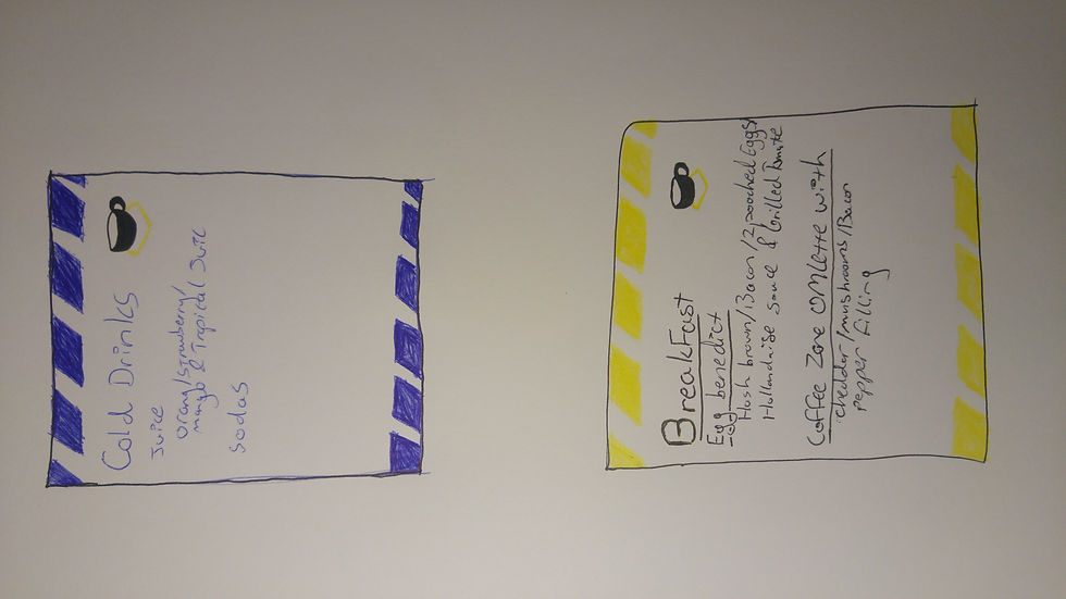
I then went on to create the new menus. I kept in mind content relating to zones and zoning. I decided on the colours red black and yellow as these are the most dominant amongst most zoned areas. The yellow already being decided on as part of the logo. In the menu I simply chose a clean and easy to read font in comparison to the existing menu. This correlates with the ease of ordering and obtaining coffee at Coffee Zone. I included the newly created Logo at the top of the menus to create clear connection between brand and its contact points. I used diagonal zoning lines at the bottom and top of the menus. One menus lines alternated between yellow and black and the other menu between red and black. I then translated this design into a coffee take away cup. Keeping the zoning lines I made them run along the bottom and top of the cup beneath the lid. The lines are yellow and black. The logo is in the centre of the cup between the zoning line patterns. The cups lid is themes with the themed colours of yellow black and red and it contrasts nicely to the whiteness making up majority of the cup.
Finally I approached the interior design of the cafe. Through my research of zoning lines I found a brand who embodies this aesthetic very well. They are called Factory Records and I drew from their work as inspiration for the interior design of Coffee Zone. I made use of factory elements such as the cement flooring and brick walls inside. I then added the themed colours of black red and yellow (sometimes white) in relation to zoning lines which were placed throughout the café. I also made use of the chevron arrow pattern as it is also used as an element for zoning when in the correct colours. These patterns were used to embody the brand identity and image and at the same time provide suggestive direction, position and purpose within the store


Comments